Lumen Skin Studio is a medical spa in Old Town Scottsdale offering injectables, facials, laser treatments and monthly skin memberships.
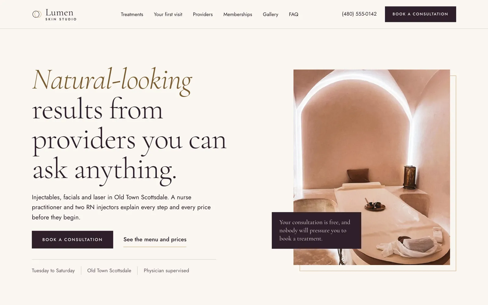



Medical spa, Scottsdale, ArizonaIts clients are women and men from 28 to 60 across Old Town, North Scottsdale, Paradise Valley and Arcadia who want natural-looking results from a provider they trust. The website had to show the full treatment menu with honest prices, introduce the nurse practitioner, injectors and aesthetician, and get visitors to book a free consultation or a first treatment.
The menu is a real price list
People compare med spas before they ever pick up the phone, so every treatment is listed with its starting price, what the price covers (per unit, per syringe, per session) and how long it takes. The free consultation sits at the top of the list as the first row, so the easiest next step is also the first thing in the menu. There are no before-and-after photos and no result promises; the page earns trust with plain information instead.
A light serif for the brand, a clean sans for the details
Cormorant Garamond sets the headlines and prices in a thin, high-contrast serif that reads as quiet and expensive. Jost handles descriptions, hours and form fields, where clarity matters more than character. The palette is deep plum, blush and bone with thin champagne lines, and the layout keeps generous white space with square-cornered photos and hairline rules instead of heavy cards.
Providers introduced in plain words
Visitors want to know who will be holding the syringe. Each of the four providers has a photo, a role and two short sentences, and a small key explains what FNP-C, RN and BSN actually mean. The medical director line appears in the FAQ and the footer, so the supervision is stated where a careful visitor will look for it.
Booking stays one thumb away on a phone
On phones a slim bar at the bottom always offers Call and Book a consultation, the header collapses to a menu button, a centered logo and a phone icon, and the price list reflows so each price stays beside its treatment name. Memberships stack into three readable blocks, and the FAQ opens one question at a time so the page does not turn into a wall of text.
- #2e1f2b
- #f3e6e4
- #faf6f0
- #c8a97e
- #7a5c32
- #231620
Typefaces: Cormorant Garamond and Jost.
- Brightwater Family DentalFamily dentistry, Boise, IdahoBrightwater Family Dental is a family and cosmetic dental practice in the North End of Boise, Idaho.
- Stoneleaf Outdoor LivingLandscape design and build, Charlotte, North CarolinaA Charlotte landscape design and build company that creates patios, outdoor kitchens, planting, lighting and drainage for homes in Myers Park, Dilworth, Eastover, Ballantyne, Cotswold and SouthPark.
- Hartwell & Rowe Family LawFamily law, Columbus, OhioHartwell & Rowe is a small family law firm in Columbus, Ohio, handling divorce, custody, support and mediation for families in German Village, Upper Arlington, Dublin, Westerville and Grandview.
- Ironridge RoofingRoofing, Fort Worth, TexasA residential roofing company in Fort Worth that replaces roofs, repairs hail and storm damage, and helps homeowners through insurance claims.
Nick reads every message himself and replies by email to work out the next step.