A residential roofing company in Fort Worth that replaces roofs, repairs hail and storm damage, and helps homeowners through insurance claims.
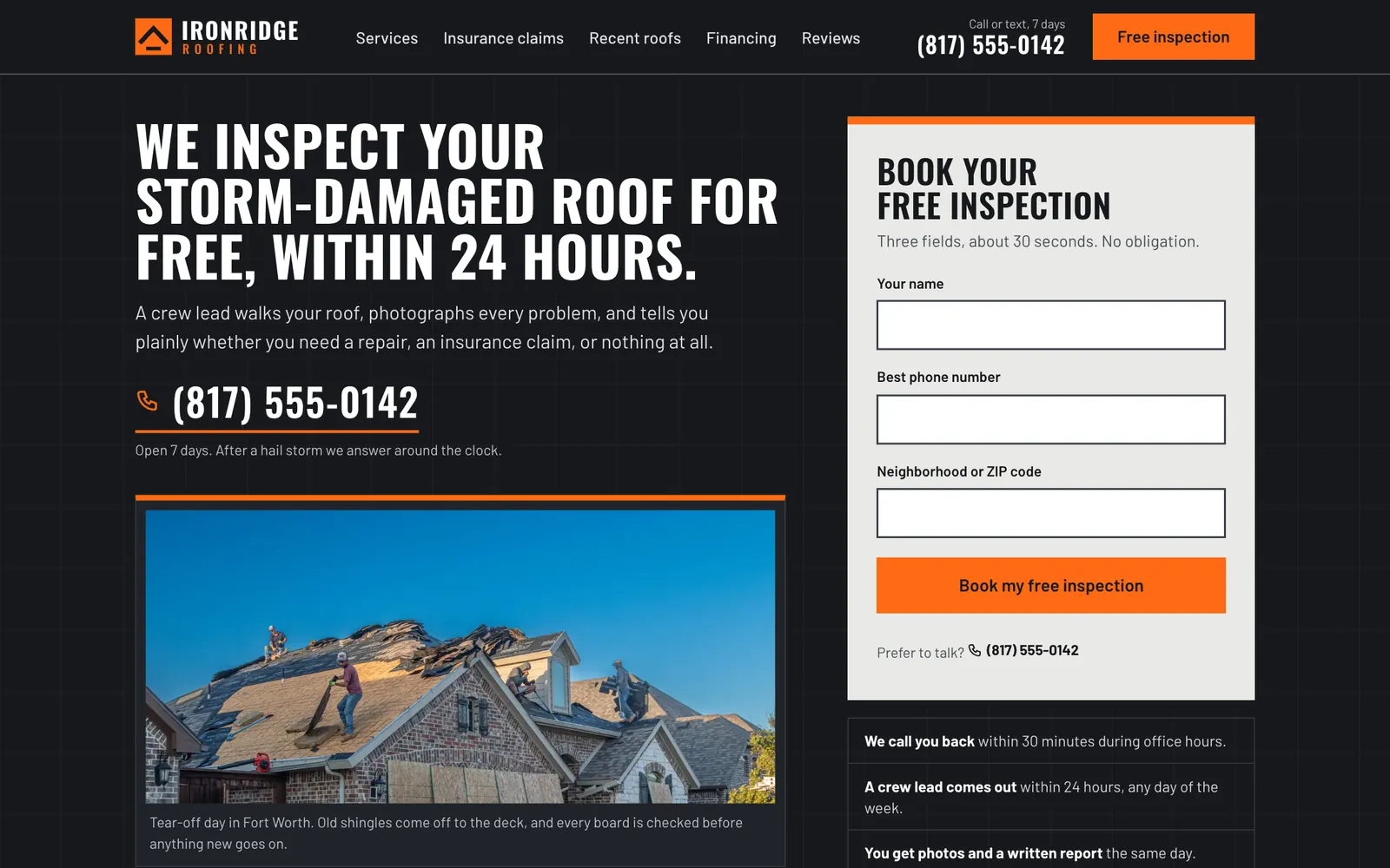
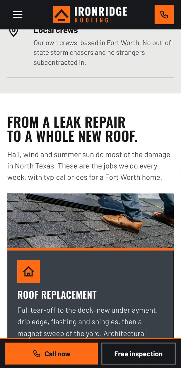
Roofing, Fort Worth, TexasIronridge's customers are homeowners in Fort Worth and the towns around it, usually just after a hailstorm or with a roof that is clearly aging. They are worried, short of time, and wary of door-knocking storm chasers. The site had to get a free inspection booked in under a minute by phone or a three-field form, explain how an insurance claim works in plain words, and show recent local roofs so they trust the crew before anyone climbs a ladder.
The inspection form sits beside the headline
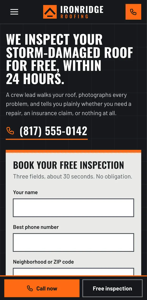
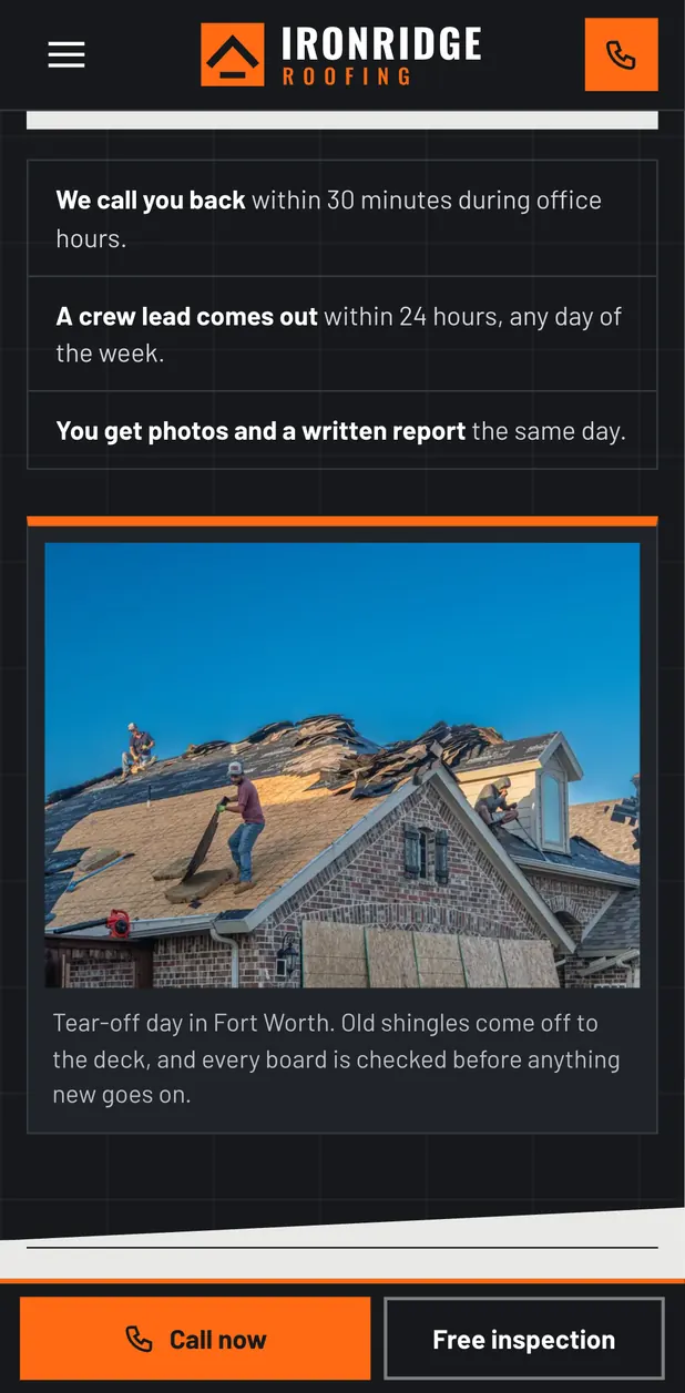
Someone with storm damage wants one thing: a person on the roof. So the headline promises an inspection within 24 hours, and the booking form is right next to it with only three fields (name, phone, neighborhood). The phone number sits under the headline in large type for people who would rather call, and the hero shows what happens after they submit.
A sticky Call now bar on phones
People searching after a storm are usually on a phone, standing in the yard or looking at a stained ceiling. A bar stays pinned to the bottom of the screen with a Call now button and a Free inspection button, so the next step is always one thumb away, however far down the page they have read.
The claim process is told as a walkthrough, with the awkward parts included
Homeowners have usually never filed a roof claim. The page walks through the six steps from inspection to final walkthrough in plain words, then adds the three Texas facts that trip people up: the filing window, the wind and hail deductible, and the line between a roofer and a public adjuster. Saying plainly what the company will not do (waive a deductible, act as the adjuster) builds more trust than a promise.
Condensed uppercase headings, a sturdy body face, and one orange
Oswald in uppercase gives the headlines the weight of site signage, and Barlow keeps the reading text sturdy and easy at small sizes. The palette is charcoal, steel and concrete grey, with hi-vis orange used only for actions and markers, always with dark text on it so it stays readable. Corners are square and sections sit on hard rules, which suits a trade built on straight edges and flashing.
- #17191C
- #3A4048
- #E9E9E6
- #FFFFFF
- #FF6A13
Typefaces: Oswald and Barlow.
- Brightwater Family DentalFamily dentistry, Boise, IdahoBrightwater Family Dental is a family and cosmetic dental practice in the North End of Boise, Idaho.
- Stoneleaf Outdoor LivingLandscape design and build, Charlotte, North CarolinaA Charlotte landscape design and build company that creates patios, outdoor kitchens, planting, lighting and drainage for homes in Myers Park, Dilworth, Eastover, Ballantyne, Cotswold and SouthPark.
- Hartwell & Rowe Family LawFamily law, Columbus, OhioHartwell & Rowe is a small family law firm in Columbus, Ohio, handling divorce, custody, support and mediation for families in German Village, Upper Arlington, Dublin, Westerville and Grandview.
- Lumen Skin StudioMedical spa, Scottsdale, ArizonaLumen Skin Studio is a medical spa in Old Town Scottsdale offering injectables, facials, laser treatments and monthly skin memberships.
Nick reads every message himself and replies by email to work out the next step.