Hartwell & Rowe is a small family law firm in Columbus, Ohio, handling divorce, custody, support and mediation for families in German Village, Upper Arlington, Dublin, Westerville and Grandview.
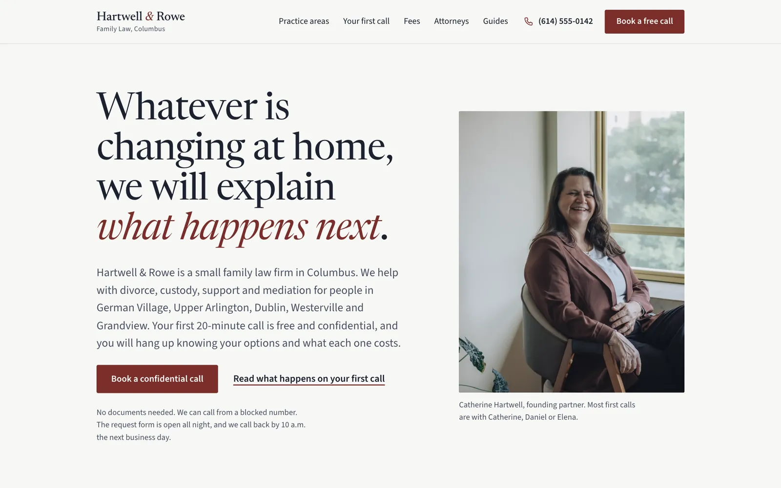
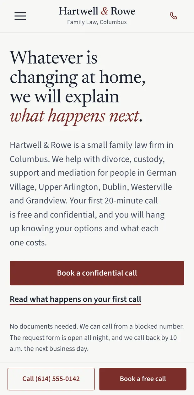
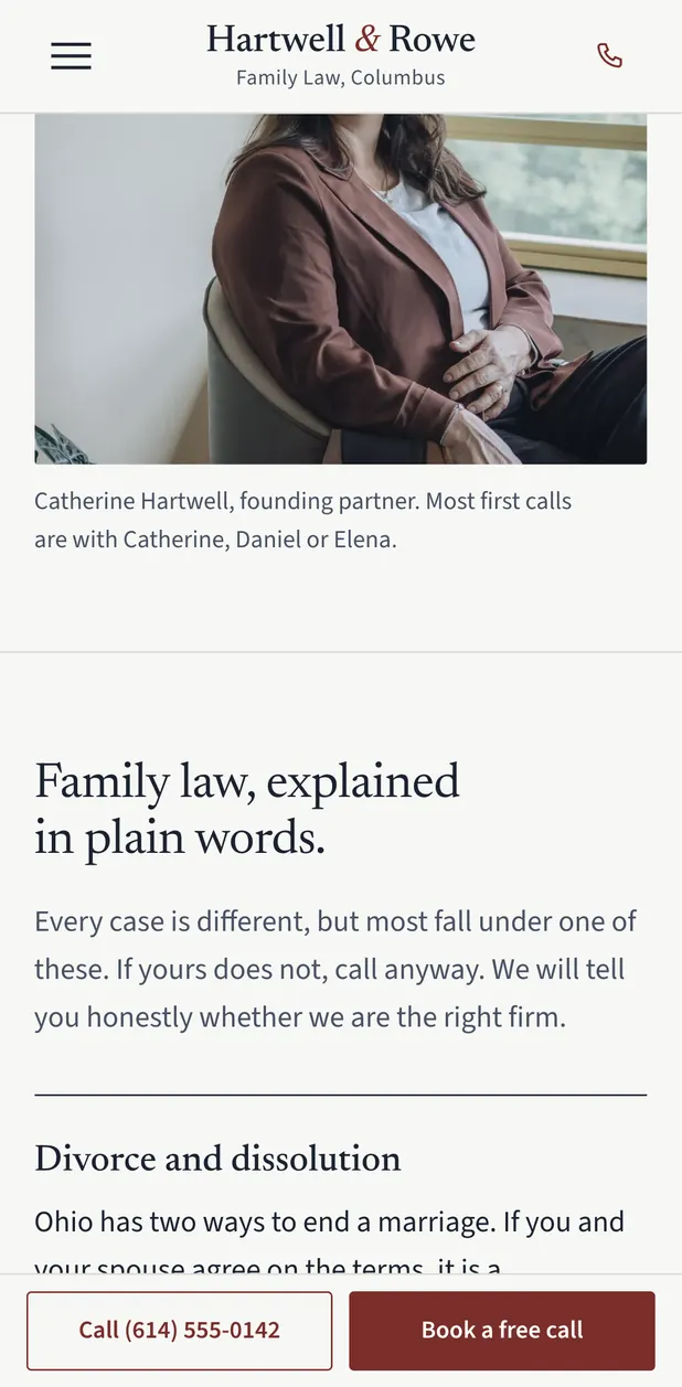
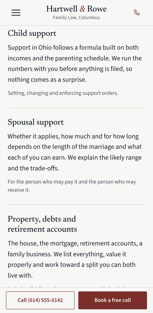
Family law, Columbus, OhioThe firm's clients are people in a stressful moment, often reading on a phone late at night and unsure what a lawyer will cost or ask of them. The site had to feel calm and discreet, explain what happens next and roughly what it costs, and lead to one action: booking a free, confidential 20-minute call without putting any case details in a form.
Calm, text-led layout with one human portrait
The first screen is a large serif headline, one reassuring paragraph and two clear choices: book a confidential call, or read what happens on that call. The lead attorney's natural window-light portrait sits beside it instead of a gavel, scales or skyline, so a nervous visitor sees a person before they see a law firm.
Fees in plain numbers, near the top of the page
People in this position worry about cost before anything else, so flat fees, hourly rates, the retainer and typical totals are laid out as a simple price list, with a short plain explanation of how a retainer works. Naming the numbers early builds trust and filters out calls that were never going to convert.
A first call explained step by step, and a form that asks for almost nothing
A short walkthrough shows what happens in each part of the 20-minute call, because fear of the unknown is the biggest barrier to picking up the phone. The form asks only for a first name, a number and a good time, with options to be called from a blocked number or not to be left a voicemail. It tells visitors not to share case details, which protects them and keeps the firm's intake clean.
Built for a phone at night
Body text is a generous 18 pixels in a clear sans serif, buttons are full width and tall, and a slim bar at the bottom of the screen keeps Call and Book a free call within thumb reach. The header collapses to a menu on the left, the centered firm name and a phone icon, and the headline pairs a refined text serif with an open sans so long reading stays easy on tired eyes.
- #f7f7f5
- #1b2230
- #7a2e2a
- #dfe5df
- #485163
Typefaces: Newsreader and Source Sans 3.
- Brightwater Family DentalFamily dentistry, Boise, IdahoBrightwater Family Dental is a family and cosmetic dental practice in the North End of Boise, Idaho.
- Stoneleaf Outdoor LivingLandscape design and build, Charlotte, North CarolinaA Charlotte landscape design and build company that creates patios, outdoor kitchens, planting, lighting and drainage for homes in Myers Park, Dilworth, Eastover, Ballantyne, Cotswold and SouthPark.
- Lumen Skin StudioMedical spa, Scottsdale, ArizonaLumen Skin Studio is a medical spa in Old Town Scottsdale offering injectables, facials, laser treatments and monthly skin memberships.
- Ironridge RoofingRoofing, Fort Worth, TexasA residential roofing company in Fort Worth that replaces roofs, repairs hail and storm damage, and helps homeowners through insurance claims.
Nick reads every message himself and replies by email to work out the next step.